UX Case Study*

A website for GRIP., a skate store and crew of skaters in Porto, designed with the design thinking framework.
- GRIP.
- 2021
- UX/UI design, Web design
*to be updated
GRIP. is a skate store and crew of skaters in Porto. It started as a small apparel and board store in the late 90's and has been growing ever since.
ABOUT THE PRODUCT
The goal was to create a website that shared the brand values and the skateboard culture. With this digital platform, they wanted to increase sales volume (Online Store), be a reference among skaters in Porto, aggregate a community of skaters in the city and in the medium/long term, have a clothing brand with their own collections.
Grip aims to differentiate itself from its main competitors through proximity to customers and technical sales.
DESIGN THINKING
For this project I used the design thinking framework - design thinking is a methodology that inspires human-centered approach to design. It helps inspire creative thinking and strategies that lead designers to create user-friendly products that help solve a particular problem.
It is broken up into five specific stages:
- Empathy
- Define
- Ideation
- Prototype
- Test
It is important to note that these phases are not necessarily on a single, defined linear path. Different stages might spark new ideas or showcase new findings in the user journey that will inspire new iterations of phases that had already been completed.
STAGE 1: EMPATHY
During this initial phase of the project I consulted subject matter experts - I talked with the GRIP stakeholders, we conducted user interviews - and I immersed myself in the physical environment. I did a competitive analysis and investigated competitor products in order to analyse their strengths and weaknesses.
STAGE 2: DEFINE
STAGE 3: IDEATION
STAGE 4: PROTOTYPE
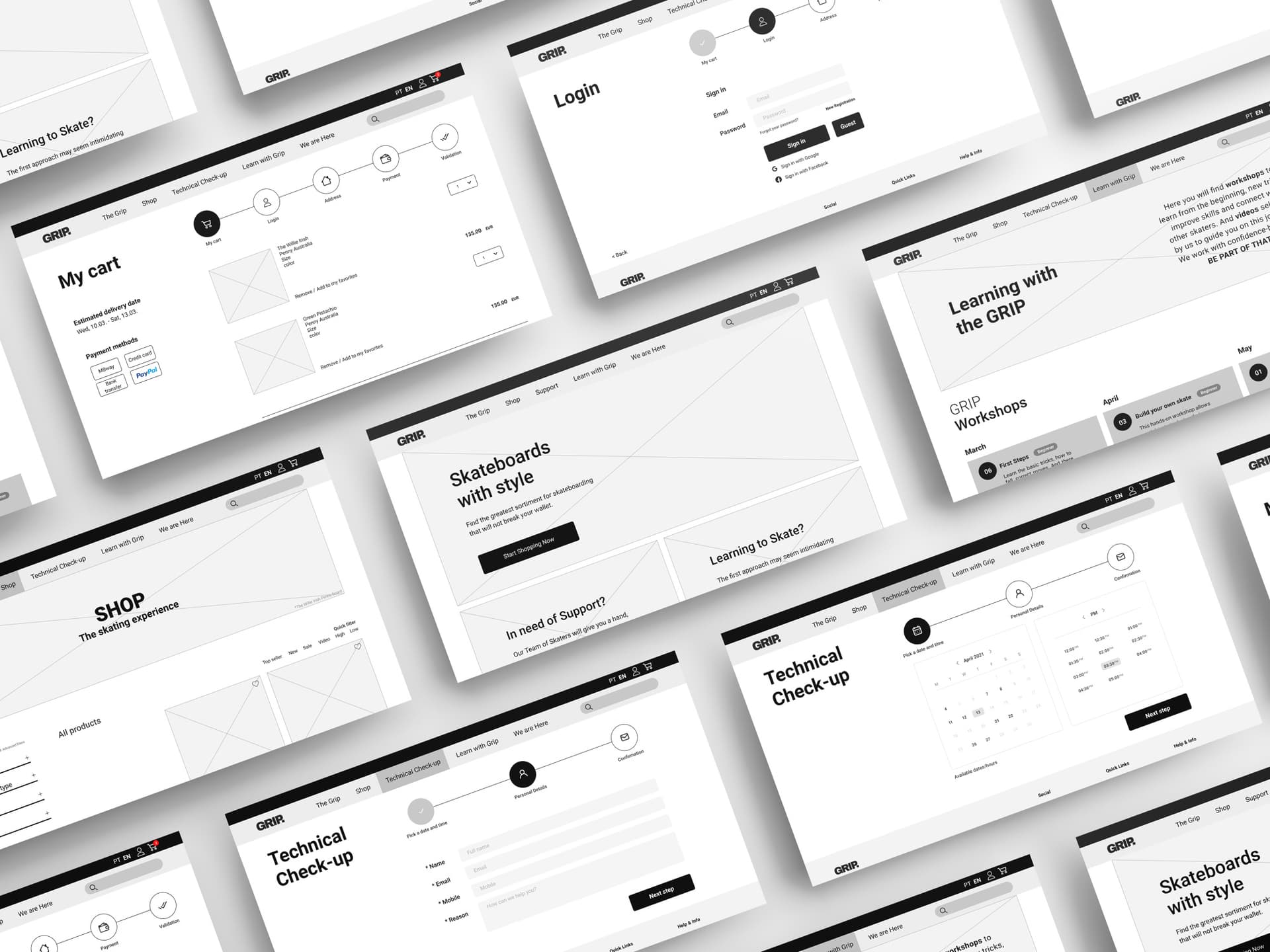
Wireframes (Desktop)
While working through multiple design steps I used medium-fidelity wireframes before designing a more fully functional prototype.
STAGE 5: TEST